設計理念:
本案業主自始即明確表達,期望跳脫傳統居家風格,
以黑色油漆作為空間主角,營造出兼具現代感與藝術氛圍的居住環境,
設計發想並非著重於繁複造型的堆疊,而是透過色彩來傳遞空間語言。
黑色,作為主色調之一
不僅打破對暗色系的刻板印象,
更精準地詮釋出俐落、純粹且充滿張力的居家美學。
From the outset, the client clearly expressed a desire to break away from traditional residential styles by using black paint as the focal point of the space. The goal was to create a living environment that embodies both modern sensibility and artistic ambiance. The design approach did not rely on intricate forms or excessive ornamentation; instead, it allowed color itself to speak as the language of the space. Black, as one of the primary tones, not only challenges common stereotypes about dark colors but also powerfully conveys a home aesthetic that is sharp, pure, and full of tension.
設計上我們不做造型堆疊的設計語言,選擇回歸空間本質,
將設計核心聚焦於色彩、光線與生活機能三大元素的協調與運用。
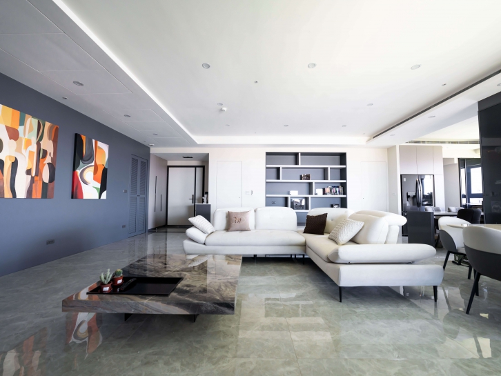
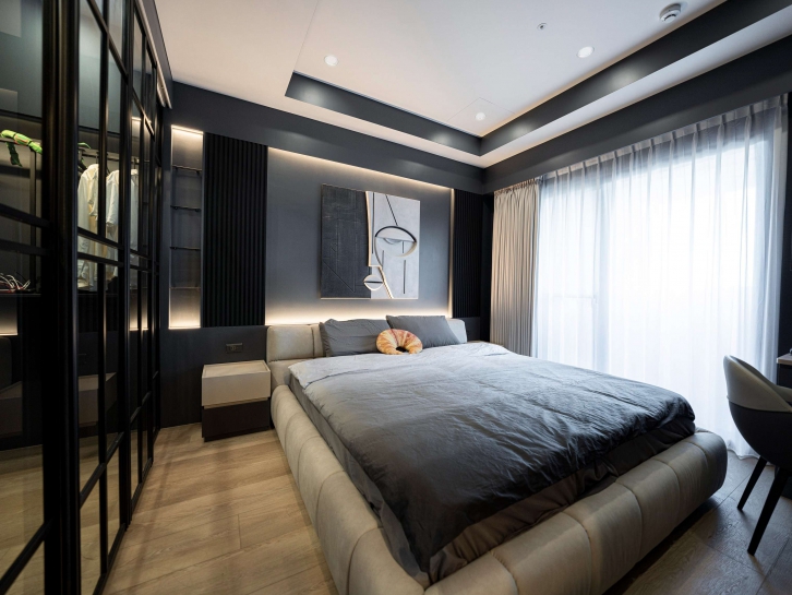
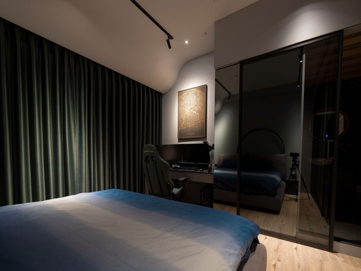
在色彩方面,我們大膽選用黑色與深色系作為空間主軸,
並以極精準的比例控制,平衡暗色可能帶來的壓迫與混亂感,
透過不同深淺與材質的搭配,讓黑不再單一,
而是轉化為具有層次與藝術張力的語彙,使整體氛圍更顯俐落與現代。
光線則作為空間情緒的推手。我們運用線燈、三段式照明及軌道燈,
搭配可調式冷暖光源,
使空間在不同時間與情境下呈現多變的視覺層次與感受,
延伸色彩與空間風格。
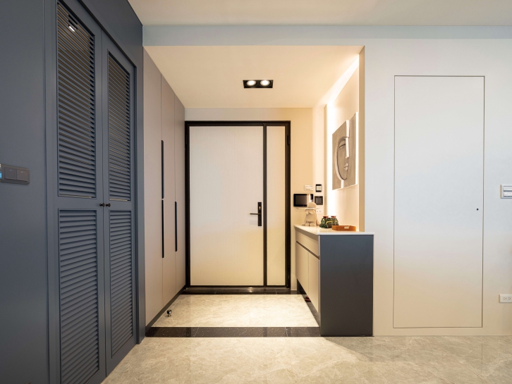
在生活機能上,我們捨棄複雜元素造型堆疊,
保留大量開放與流動的空間,提升使用面的靈活性與舒適度,
動線清晰、分區合理,無論是日常起居或情境轉換,
都能在視覺美感與實用性間取得平衡。
In this design, we intentionally avoided decorative layering or excessive form-making. Instead, we returned to the essence of space, centering our design philosophy on the harmonious integration of color, lighting, and spatial function.
For color, we boldly selected black and other dark tones as the core visual language. Through precise proportional control, we balanced the potential heaviness and chaos that darker hues might introduce. By combining various shades and materials, black was transformed from a flat, singular tone into a layered, expressive vocabulary rich with artistic tension—delivering a sharper, more contemporary atmosphere.
Lighting was used as a key emotional driver of the space. Through the use of linear lights, three-stage lighting, and track fixtures, paired with adjustable warm-to-cool color temperatures, the space is capable of shifting moods and visual depth throughout different times of day and scenarios—further reinforcing the chosen palette and style.
In terms of spatial function, we eliminated unnecessary complexity and maintained a generous sense of openness and flow. This enhances both comfort and adaptability in daily use. With clear circulation and thoughtful zoning, the space achieves a well-balanced blend of visual elegance and practical living.
本案選用班傑明摩爾「超耐磨系列-蛋殼光」作為主要塗料,
不僅因其高品質的耐用特性,更著眼於其細緻的反光效果。
我們運用蛋殼光特有的微光澤質地,
巧妙結合案場本身優越的自然採光條件,
讓深色塗料在空間中不顯沉重,
反而在光線映照下展現柔和且內斂的光影層次,
讓「黑」成為包裹空間氛圍的背景,提升空間的沈靜感與張力,
同時賦予場域如藝廊般的高雅質感。這不再是冷峻的「死黑」,
而是一種有呼吸、有表情的深色調性,
成功營造出一個充滿藝術氣息與強烈風格的現代居所。
For this project, we selected Benjamin Moore’s SCUFF-X® in an eggshell finish as the primary paint—not only for its exceptional durability but also for its subtle reflective quality. The soft sheen of the eggshell texture was skillfully paired with the site’s abundant natural light, allowing the deep-toned paint to avoid heaviness. Instead, it reveals a gentle, refined interplay of light and shadow throughout the space.
Here, black becomes the atmospheric backdrop that envelops the interior, enhancing a sense of calm and spatial tension while lending the environment a gallery-like elegance. This is not a stark, lifeless black—it is a deep tone that breathes and expresses, bringing depth and character. The result is a modern home filled with artistic presence and bold identity.
在材質與塗裝選擇上,我們特別考量黑色塗料在光線條件下的表現,
由於亮光黑容易產生強烈反光,若應用於光源直射的牆面,
可能導致視覺眩光或色澤不均,
因此,本案選用班傑明摩爾「超耐磨系列」蛋殼光作為主體塗料,
其低反光的細緻光澤,能在保有質感的同時降低刺眼反射,
使色彩表現更為穩定與內斂。
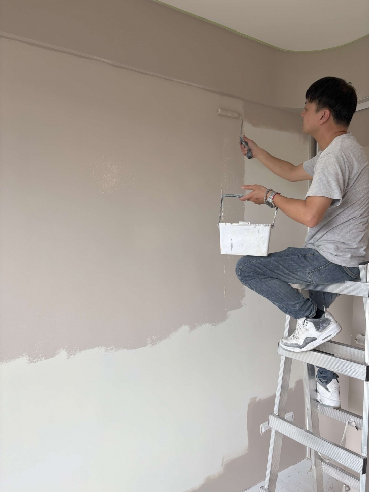
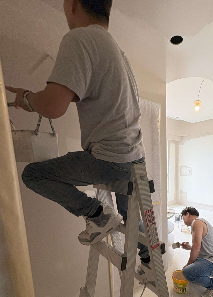
黑色雖具高度表現力,但其施工難度相對較高,
不僅容易顯色不均,亦較易吸附灰塵與留下刷痕,
為確保最終質感,我們在施工階段嚴格控管每一道工序,
包含底層處理、均勻上漆與多次覆蓋,並搭配透明保護漆使用,
強化表面耐磨性與抗污性,讓黑色的深邃與細膩得以長時間穩定呈現,
將材料價值發揮至最大。
In selecting materials and paint finishes, we carefully considered how black paint would behave under various lighting conditions. High-gloss black, for instance, can produce harsh reflections, which—when applied to walls exposed to direct lighting—may result in glare or uneven color perception. To address this, we chose Benjamin Moore’s SCUFF-X® in an eggshell finish as the primary coating. Its low-reflective, refined sheen preserves a premium texture while minimizing disruptive glare, allowing the color to appear more consistent and understated.
While black is a highly expressive color, it is also one of the most technically demanding to apply. It tends to reveal uneven coverage, attracts dust more easily, and can highlight brush marks. To ensure a flawless finish, we implemented strict quality control throughout every stage of the painting process—from base layer preparation and uniform application to multiple coats for depth. A clear protective topcoat was also applied to enhance abrasion resistance and stain protection. This meticulous approach allows the richness and subtlety of black to remain stable over time, fully maximizing the material’s aesthetic and functional value.
使用產品:
▸多功能底漆
▸超耐磨系列-蛋殼光 964_White Sand

▸超耐磨系列-蛋殼光 AF-695_Eternity

▸超耐磨系列-蛋殼光 2126-30_Anchor Gray

▸超耐磨系列-蛋殼光 1609_Temptation

團隊介紹:
極喀室內裝修設計有限公司-邱蘭雁
不局限於單調風格,藉由不同材料和對美感的專業,去為每個空間打造出獨特且舒適的氛圍,
更是能為客戶設計出理想中的風貌,甚至進一步的智能宅規劃,根據不同客層需求量身訂做服務流程,
致力於創造不僅美觀,更是重視居家的健康與實用,
擅長將生活融入科技,更是推廣執行綠裝修,
以居住健康、舒適為優先考量,依照「GD綠裝修認證」的評估與要求。
亞輝工程行-黃佳妮
民國108年成立公司,師傅皆有超過10年以上經歷,
室內外油漆、舊屋翻新、防水工程、壁癌修補、特殊色調配,
為客戶打造兼具美觀與實用性的空間。