設計理念:
業主偏好日式風格,希望住宅能展現獨特性與個人品味,
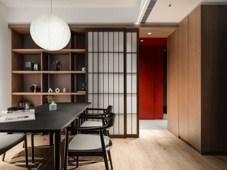
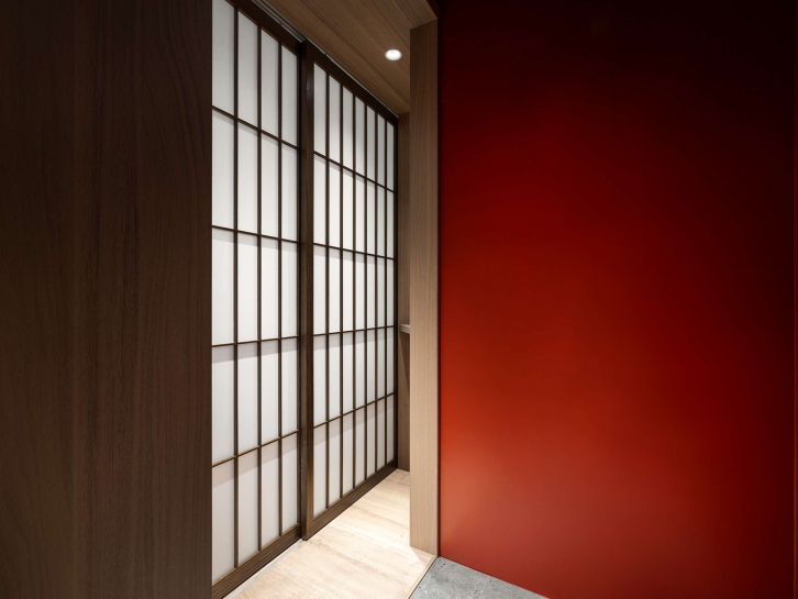
為了營造空間的辨識度,我們選擇以紅色作為視覺重點,
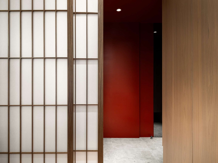
然而,紅色在居家氛圍中較為強烈,因此將其配置於玄關區域,
作為進入主空間的色彩引導,
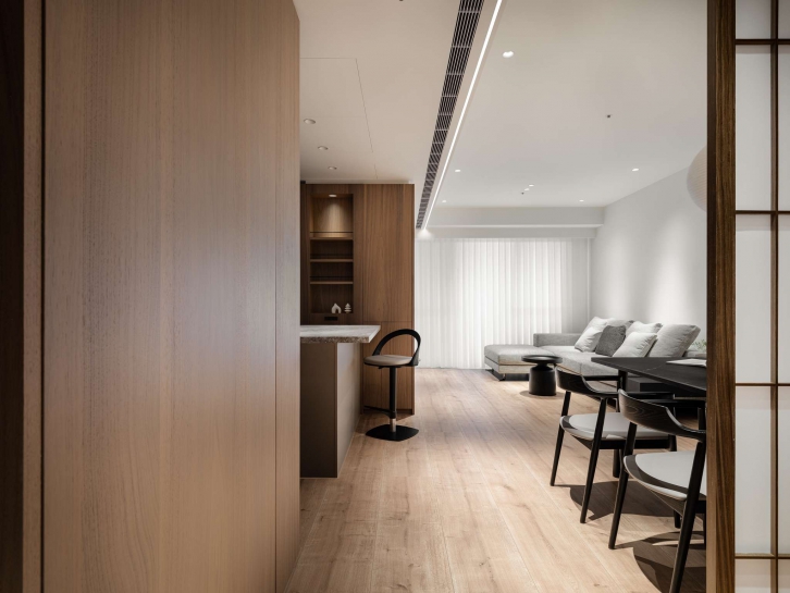
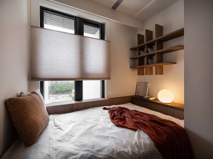
客餐廳則以暖黃色光源搭配深色木皮,
平衡整體色調,營造溫潤沉穩的氛圍,
同時,透過可調整的日式拉門設計,使空間具備彈性,
使用者能依照心情或情境自由轉換,
讓生活場域在靜與動之間取得和諧的平衡。
The client prefers a Japanese-inspired aesthetic, aiming for a residence that reflects individuality and refined taste. To create a distinctive visual identity, we chose red as the key accent color. Since red can feel intense within a living environment, it is strategically applied in the entrance area to serve as a visual guide leading into the main space.
In the living and dining areas, warm yellow lighting is paired with dark wood veneers to balance the overall color palette, cultivating a cozy and composed atmosphere.
Additionally, the incorporation of adjustable Japanese sliding doors adds spatial flexibility, allowing residents to transform the layout according to mood or occasion. This adaptability fosters a harmonious balance between tranquility and dynamism in daily life.
在多數文化中,太陽被視為黃色的象徵,
然而在日本文化裡,太陽則以紅色呈現,
這也使紅色成為日本美學中極具代表性的元素,
以此為靈感,設計中將象徵太陽的紅色運用於入口玄關,
作為空間的視覺焦點與跳色點,
這不僅呼應了整體日式風格的設計語彙,也在來訪者踏入室內的第一刻,營造出令人印象深刻的空間體驗。
In most cultures, the sun is symbolized by the color yellow; however, in Japanese culture, it is represented by red. This association has made red a significant element in Japanese aesthetics. Drawing inspiration from this concept, the design applies the color red—symbolizing the sun—to the entryway as an accent feature. This choice not only harmonizes with the overall Japanese-inspired interior but also creates a striking first impression, offering visitors a sense of warmth and surprise upon entering the space.
整體空間以 OC-130 Cloud White 作為主色調,
其細緻的漆面質地帶有柔霧感,為空間披上一層柔和的光影氛圍,
使牆面呈現溫潤且具層次的細膩質感。
玄關區域則特別選用 AF-290 Caliente
不僅呼應業主希望以跳色突顯個性的設計需求,
更利用此色漆優異的耐磨特性,提升牆面的實用性與耐久度,
鮮明而飽滿的紅色成為整體空間的視覺焦點,
與主色的柔白形成對比,
為居家注入鮮活的能量與高質感的設計語彙。
The primary color scheme of the space features OC-130 Cloud White, whose refined matte texture creates a subtle mist-like effect that gently diffuses light, casting a soft and elegant glow throughout the interior. For the entryway, AF-290 Caliente was intentionally selected—not only to fulfill the client’s desire for a vibrant accent but also for its exceptional durability, ensuring better protection for the wall surfaces in this high-traffic area.
The rich, saturated red tone serves as the focal point of the design, offering a bold contrast against the soft white backdrop and elevating the overall sense of warmth, depth, and sophistication within the space.
在施作過程中,特別重視材質之間的銜接與細節控制,
盡量避免異材質直接相接,
以防止因不同底材的吸水率差異而造成色澤不均或塗層變化,
施工完成後,現場會全面清空,讓漆面在無干擾的環境中充分乾燥,
確保塗料的穩定附著與色彩表現。唯有完全乾透的漆面,
才能充分展現其優異的耐磨與抗汙性能,體現設計品質的細膩與持久。
During the construction process, particular attention was given to the junctions between different materials, carefully avoiding direct contact between dissimilar substrates. This prevents inconsistencies in color and finish caused by variations in material absorbency. After each coating stage, the site was fully cleared to allow the paint to dry completely in an undisturbed environment, ensuring optimal adhesion and surface stability. Only when the coating is fully cured can it truly demonstrate its durability and stain-resistant qualities—reflecting the precision and craftsmanship embedded in the design.
使用產品:
▸多功能底漆
▸極致系列-平光 OC-130_Cloue White

▸超耐磨系列-蛋殼光 AF-290_Caliente

團隊介紹:
成舍企業股份有限公司-南西分公司
設計師:陳柏儒
對我來說,空間設計不只是建造東西,而是在創造一個生活方式,
像人一樣有各自獨特的特質以及生命和故事,
每一個設計在這個世界都是獨一無二的,
不是由我一個人達成,而是和使用者一起才能產生的效果,
無論經歷過多少案子,我始終關注設計如何影響人的行為,
以及空間與人之間的互動關係,那才是空間的起始點。
藝廬美學塗裝有限公司
林俊男、張榮豪、羅蕙瑄
每天與油漆、稀釋劑為伍的日子,深刻體會這些材料對環境的影響,
因此,決定要用更負責任的方式,
讓「塗裝」不只是工作,而是一種創造美與善的過程。
身為「藝廬美學塗裝」的創辦人,
我相信,職人能在牆上留下色彩,也能在世界留下責任,
我們以專業、環保與美感為核心,
讓每一面牆都成為生活美學延伸,
藝廬美學塗裝—塗的不是牆,是一種生活態度。